Letters from the Director

Discover something new
Dear friends,
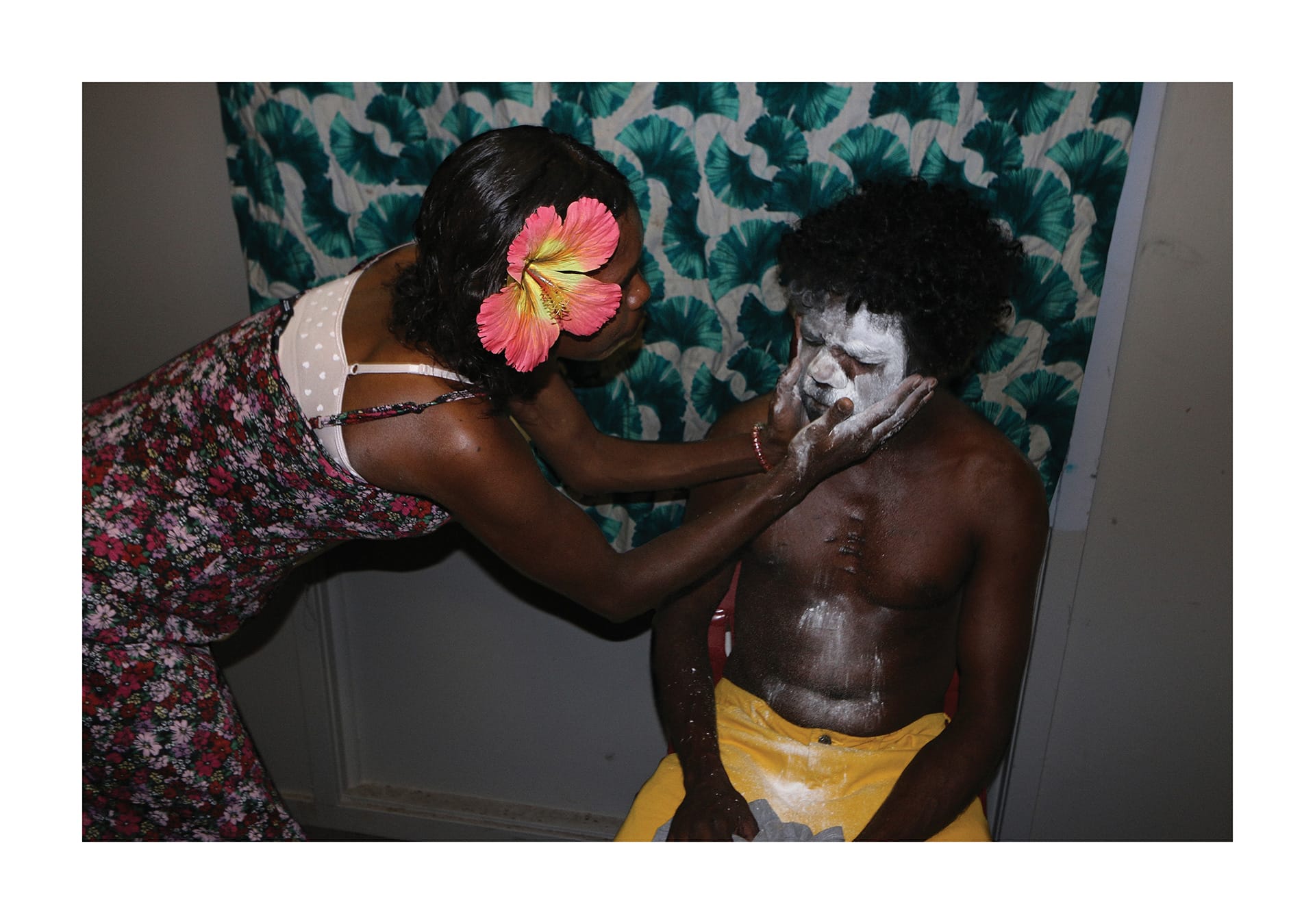
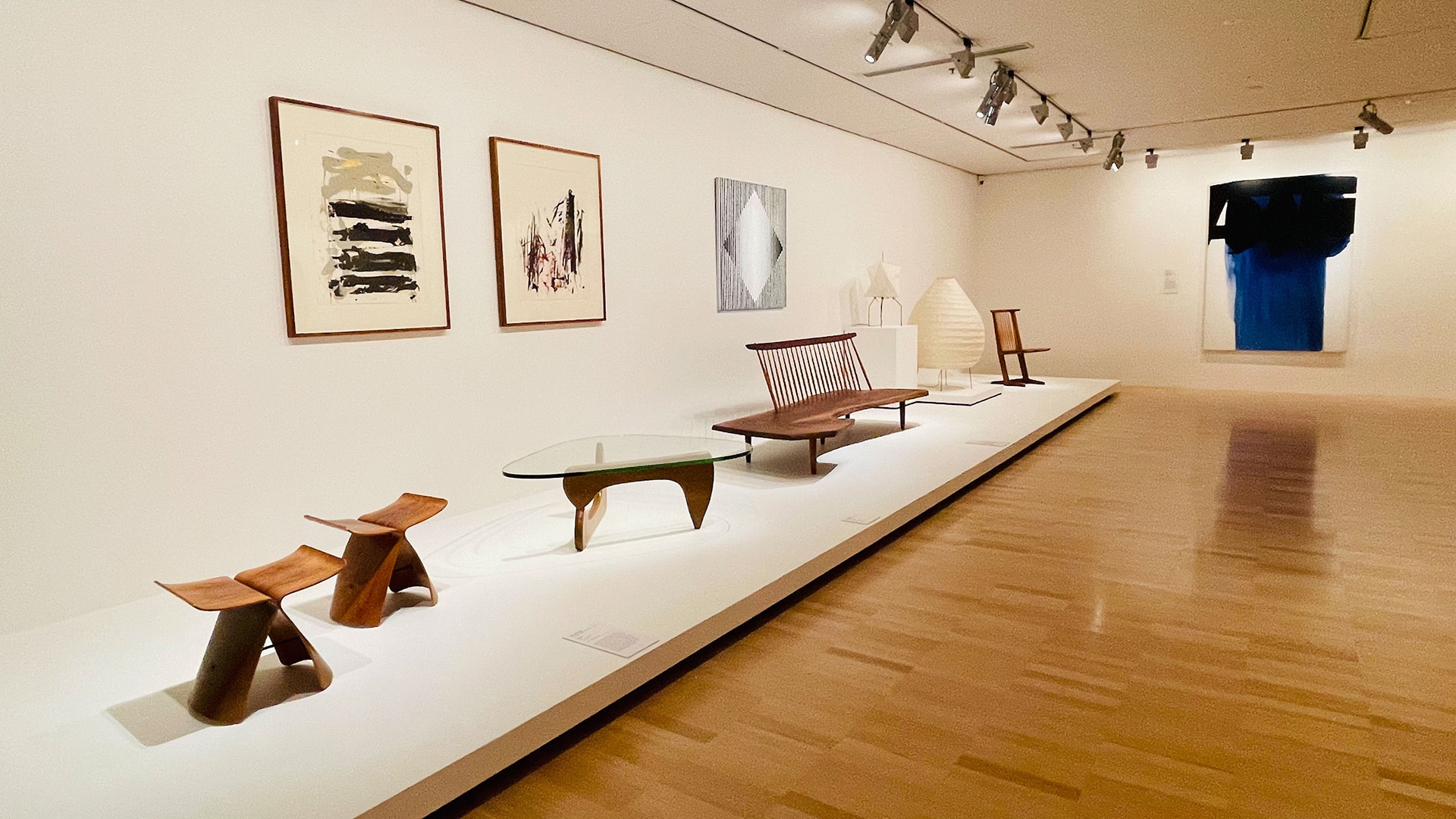
Last week we reopened the NGV, and it has been truly wonderful to see visitors rediscovering works and moments that have been so missed over the past months. The NGV Collection is home to over 75,000 works of art and design that cross Country, coasts, continents, and cultures. We regularly create new Collection displays so that around every corner there are old favourites to reconnect with and always something new to discover. This week, I thought we’d share some fantastic new works that we have recently acquired for our Collection and are now on display for you to see during your next visit.