Pop artists in the United States in the 1960s and 1970s questioned the way Americans were bombarded with advertising images encouraging them to consume more and more products - they were being persuaded to buy, rather than to think.
Pop Art emerged at a time of great economic growth in America post World War II. Pop artists not only commented on everyday popular culture, but celebrated popular culture and ironically made art look like it. Artists often reworked everyday images such as those from comic strips, billboards, television, magazines and shop displays.
Pop Art was often fun and funky, even if it referred to a serious issue, llike capital punishment in the work of Andy Warhol. It was usually eye catching in its use of colour. The approach and techniques used were more often found in an advertising agency than a traditional art school. Some Pop Art, like the work of Roy Lichtenstein, was made billboard size with reference to commercial silkscreen printing technique. Looking kitsch and common, Pop Art was very different from preceding art styles such as the contemplative and lyrical images of Abstract Expressionism. In some cases very realistic portrayals of the everyday incorporated life sized figures and objects as seen in the work of George Segal.
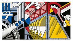
Roy LICHTENSTEIN
American 1923–97
Preparedness 1968
oil and Magna on canvas, 3 panels
304.8 x 548.7 cm
Solomon R. Guggenheim Museum, New York
© Roy Lichtenstein/LICHTENSTEIN, New York. Licensed by VISCOPY Australia
69.1885
"From the beginning, I felt that comic-strip painting had to be de-personalised. It had to express great emotions – passion, fear, violence – in an impersonal, removed and mechanical manner"
Roy Lichtenstein, born America 1923
Around the end of 1961 Roy Lichtenstein broke from his abstract methods and discovered cartoons as both inspiration and source-material for his art. His preferred material was romance or war-inspired, but when reinterpreted by Lichtenstein the comics are always laced with irony.
Central to Lichtenstein’s identification as a Pop artist is his use of the Benday dot, the standardized tool of poor quality printing of junk mail pamphlets, newspaper imagery and comic strips, and the 1960s equivalent of the pixel.
In an interview, Lichtenstein explained his choice of comic frames for his works:
"I try to look for something that says something mysterious, or absurd, or obvious or extremely simple or extremely complicated. Something visually or if there are words to it – something that when it’s a painting and not a part of a comic strip that it will strike you as funny…or…usually funny. ……….. It’s the drama and heroics and of course, none of the consequences – we still think of war that way."
Roy Lichtenstein
Lichtenstein developed an avant-garde style that was intellectually challenging and culturally disruptive, yet his works and their terms of reference were also accessible to the general public.
Lichtenstein described Preparedness, which is seen here, as
"a mural-esque painting about our military-industrial complex."
It was painted in 1968, a year in which public opinion on American involvement in the Vietnam War shifted dramatically. Back in 1943, Lichtenstein had been drafted into the US army, serving in Europe in World War II for three years. Perhaps informed by his personal experience of war, Preparedness was intended as a direct social comment; a questioning of nationalistic optimism that comes with a call-to-arms. He said:
"You realise that I’m not serious about the glory of defending our shores against foreign devils, as these works would imply. But the purpose isn’t only the reverse. It is also a statement about ‘heroic’ composition."
Part of the dynamism of this work lies in the strengths of the altar-like triptych. Its size recalls a billboard promotion, where advertising – even of the most unnecessary or unsavoury products or ideas – enters the public sphere as a form of unchecked social preaching.
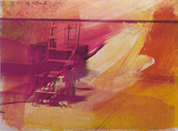
Andy WARHOL
American 1928–87
Electric Chair 1971
10 screenprints on paper, ed. 193/250
89.5 x 121.9 cm
Solomon R. Guggenheim Museum, New York
Gift, Mr Peter M. Brant
© Andy Warhol/ARS, New York. Licensed by VISCOPY Australia
73.2048.1-.10
"It was Christmas Day or Labour Day – a holiday – and every time you turned on the radio, they said something like ‘4 million are going to die’. That started it. But when you see a gruesome image again and again, it does not really have any effect."
Andy Warhol, born America 1928
Andy Warhol is legendary for his silk screened images of compelling subjects such as the electric chair. We are numbed by these images, as we are by the constant overloading of media images. Warhol challenges the very notion of what is truth. If we are so overloaded and numbed perhaps we can’t recognise it. He explored what Art is by presenting this extraordinary subject.
As the artist most often identified with Pop Art in the United States, Andy Warhol began his career as a commercial artist and illustrator. During the 1950s his drawings were published in magazines and newspapers, displayed in department stores and exhibited at various New York galleries. In 1962 Warhol began showing his silkscreen paintings in solo exhibitions at the Ferus Gallery in Los Angeles and the Stable Gallery in New York.
In 1963, at the height of his fame, Warhol suddenly announced that he would no longer be actually making the work:
"I think somebody should be able to do all my paintings for me"
In the early 1960s Andy Warhol began to make paintings featuring a serial use of appropriated images around the theme of death and disaster. Warhol’s images included Electric Chair 1971, other horrific images of car crashes and the tragic death of the celebrity Marilyn Monroe.
Andy Warhol manipulated a photograph of the electric chair taken in Sing Sing Penitentiary New York where the condemned Soviet spies Julius and Ethel Rosenberg had been executed on 13 January 1953 at the height of the Cold War. This photograph of the electric chair was released by the press service Wide World Photo on the day of the execution.
Electric Chair 1971 features fields of garish candy colours such as pinks, mauves and apricots combined with repetition to numb the viewer to the gruesome nature of the source image.
Warhol deals primarily with issues from the media and the desensitisation of people consuming horrific images and information from newspapers, television and other mass media.
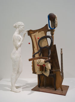
George SEGAL
American 1924–2000
Picasso's Chair 1973
plaster, wood, cloth, rubber, and string
198.1 x 152.4 x 81.3 cm
Solomon R. Guggenheim Museum, New York
Gift, Dr Milton D. Ratner
© George Segal/VAGA, New York. Licensed by VISCOPY Australia
76.2279
George Segal’s Picasso’s Chair 1973 was a new spin on a traditional nude with still life subject, and in particular a new twist on Pablo Picasso’s cubist period. It was made in order to examine Segal’s relationship to the history of twentieth-century art. Segal was inspired by Picasso’s idea to:
"enter the space [him]self, and be able to see a series of objects from many points of view".
George Segal’s white plaster body casts depict both an individual and a type of figure: an artist’s model. The figure has a melancholic quality as she stands next to old world objects from daily life, ranging from a chair to a dining setting. This creates a portrayal of life in modern society based on a fractured past.
George Segal developed a distinctive signature style that cleverly fused aspects of art and real life into large-scale sculptural tableaux.
George Segal met the composer John Cage at classes at the New School for Social Research. Segal viewed Cage as the person who most inspired him to connect art with tangible reality. Segal was able to make casts in pieces from live models. White and life-size, the resulting figures seem like-ghostly presences, despite their rough surfaces.
Picasso’s Chair was inspired by a Picasso etching in the Solomon R. Guggenheim Museum’s collection, Model and Surrealist Figure (No. 74 from the Vollard Suite), 1933.
Segal described the revealing process of creating the work:
"I was attracted to an etching as a blueprint from which I could build a genuine cubist sculpture. I cut out a piece of plywood and that was the wall, except it was standing in pure space. I added one element on top of and in front of that, another element in front of that ... I discovered something extraordinary after I finished doing it. Using this pure cubist technique to make an absolutely orthodox cubist work, I had replicated a proscenium stage and the precise method of seeing perspective in planes in receding space".
Body casting is a process that involves wrapping a model in bandages impregnated with wet plaster. The bandages dry and stiffen in the exact form of the model. Although you lose fine detail in the face, you are able to capture precisely the pose and shape of the model’s body. Segal believed they gave:
"the physical sensation of an actual human being occupying real space".